How to customize Canva templates without looking generic
Learn how to customize Canva templates so they match your brand, stand out on social media, and don’t look like everyone else’s.
Canva templates are one of the easiest ways to create content quickly. But if you use them as-is, your posts can start to look exactly like everyone else’s.
The good news? You don’t need to be a designer to fix that. With a few simple tweaks, you can turn any template into something that actually feels like your brand!
Most of these tips work best with Canva Pro – but you can still apply a lot of them on the free plan, too.
Step #1: Choose the right template
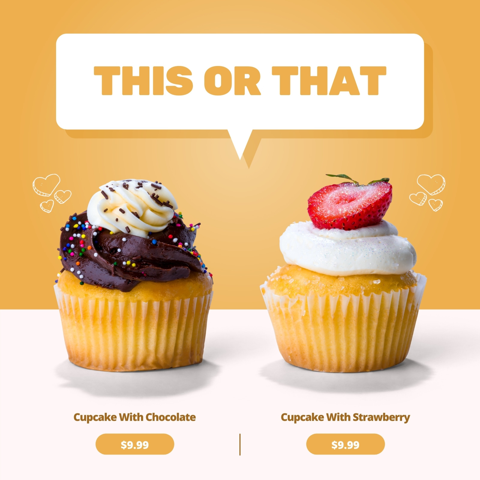
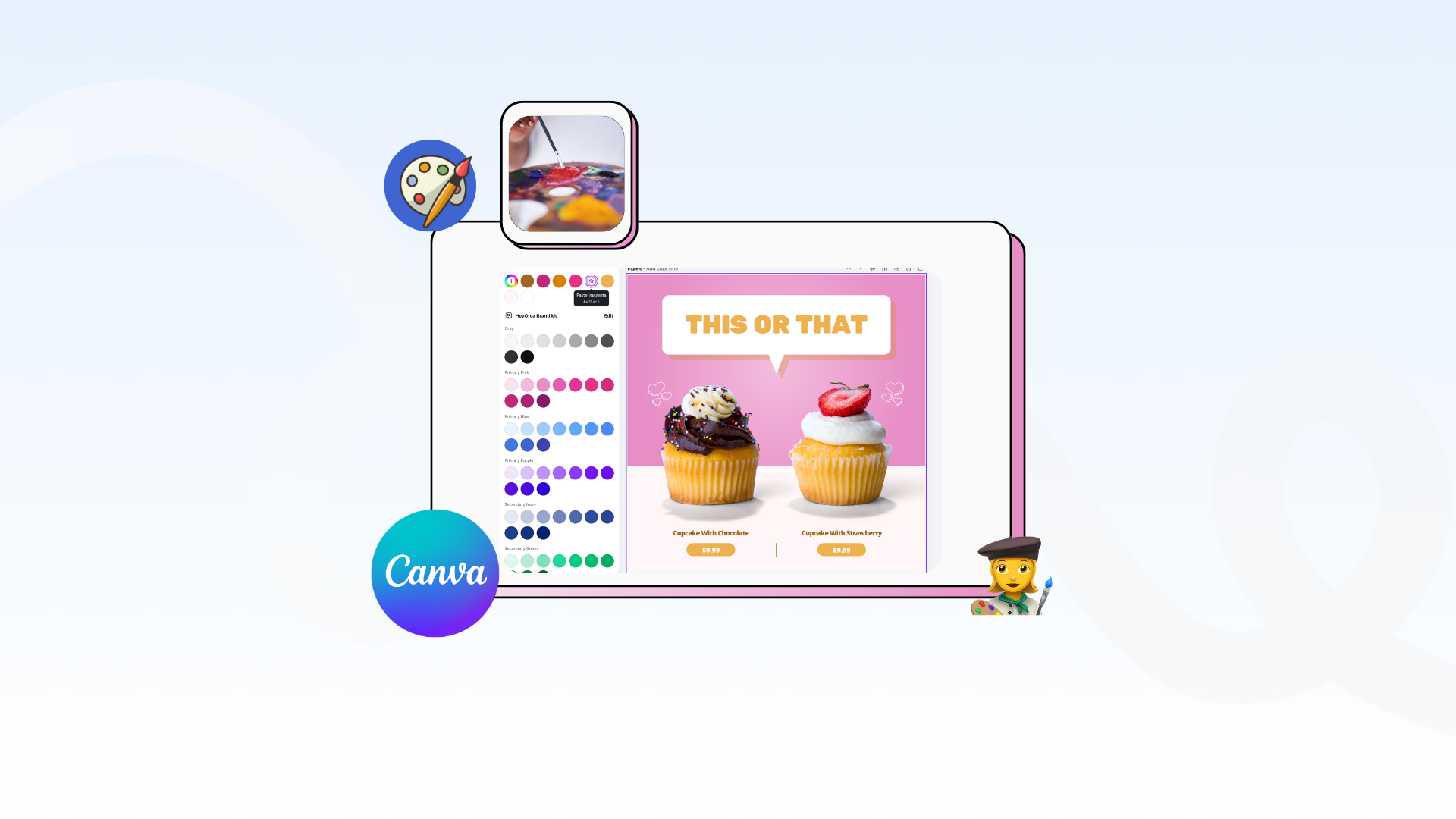
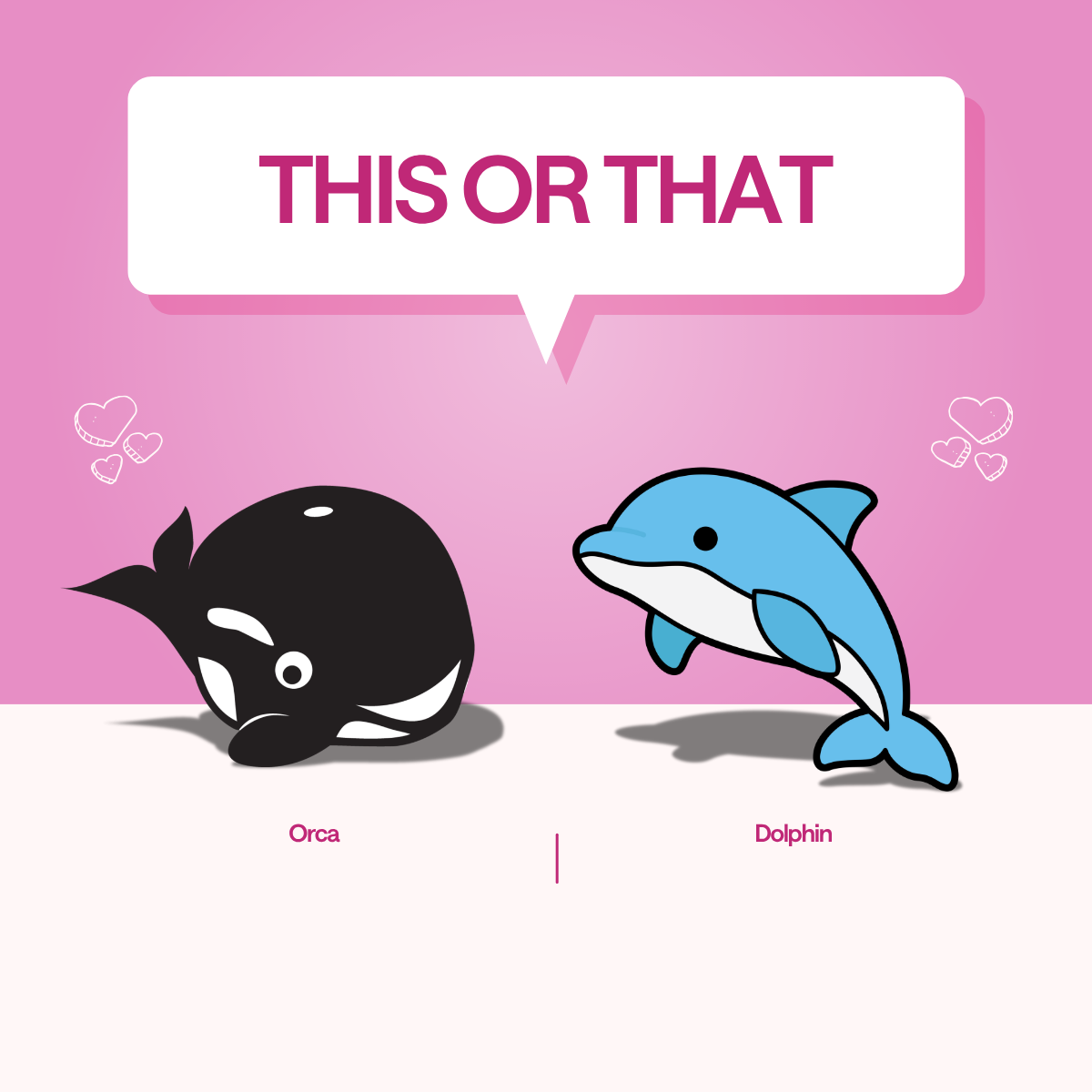
Start with a template that already has the layout you need. For this example, we’re going to use this “THIS OR THAT” Canva template to start.
Don’t worry about colours, fonts, or images yet – those are easy to change. For now, focus on structure:
- Where is the headline?
- Where do images sit?
- Is it text-heavy or visual-first?
If the layout works, everything else becomes much easier.
Orca tip: Duplicate the original social media template before editing so you always have a clean version to go back to.
Step 2: Change the colours to match your brand

This is the fastest way to make a template feel custom.
A simple trick you’ll hear a lot is: match light colours to light, and dark to dark.
Here’s what that actually means:
- Templates are designed with contrast in mind (light backgrounds, darker text, etc.)
- If you swap a light colour with a very dark one, the design can feel “off” or harder to read
So instead:
- Replace light colours (like beige, pale pink, light grey) with your brand’s lighter colours
- Replace dark colours (like black, navy, dark green) with your brand’s darker tones
This keeps the balance of the design intact.
A quick note on colour theory

Here are a few helpful rules:
- High contrast = more attention
Dark text on a light background (or vice versa) is easiest to read - Similar colours = more cohesive
Colours that are close together (like blue + teal) feel calm and consistent - Bright colours = energy
Great for calls-to-action or highlighting key info - Too many colours = chaos
Stick to 2–4 colours max in one design
If you’re unsure, use one main colour and different shades of it. It’s the easiest way to stay on-brand.
Step 3: Add in your images

If you can, use your own images. They’ll always feel more original and aligned with your brand.
If you’re using stock:
- Look for images that match your tone (not just your topic)
- Avoid overly staged or generic visuals

Now, with your chosen image/graphic:
- Start by placing it on top of the existing one in the template
- Next, match it so it fits the size and position of the template image
- Finally, delete the template image

Orca tip: You can also keep small elements from the template (like shadows or shapes) if they add to the design
Step 4: Add or remove elements

Templates often include extra elements to make them flexible – but that doesn’t mean you need all of them!
Go through your chosen template and ask yourself: Does this support the message? Or is it just filling space?
With that in mind, remove anything that feels unnecessary. Add elements only if they make the content clearer or more engaging. More often than not, more isn’t better.
Step 5: Swap in your brand fonts
Switching to your brand fonts instantly makes your content feel more you.
If you don’t have brand fonts:
- Use one font for headings
- Use one font for body text
That’s it. Two is enough.
What’s the difference between serif and sans serif?
- Serif fonts (with small “feet” on the letters) feel more traditional or editorial
- Sans-serif fonts (clean, no extra lines) feel more modern and simple
Most social content leans sans serif because it’s easier to read on mobile.
Step 6: Fix alignment and spacing

This is the step that makes your design feel polished!
What is hierarchy in design?
Hierarchy is just a fancy way of saying: What do you want people to notice first, second, and third?
You create hierarchy by:
- Making important text bigger
- Using bold or contrasting colours
- Placing key info where the eye naturally goes (top or centre)
If everything is the same size and weight, nothing stands out.
What to check before you’re done:
- Is the headline the most noticeable element?
- Is the text easy to scan quickly?
- Are things evenly spaced?
Even small adjustments here can take your design from “fine” to “really good.”
Design hacks to make your content stand out
Most generic-looking content has one thing in common: too much going on.
Instead, focus on:
- Consistency: Same spacing, colours, and fonts throughout
- Contrast: Make important elements stand out clearly
- Simplicity: Remove anything that doesn’t add value
- Negative space: Give your design room to breathe
Negative space (aka empty space) isn’t wasted space; it actually helps everything else stand out.
Canva design hacks
Once you’ve customized a few designs, you don’t want to start from scratch every time.
- Save your designs as templates
- Use Canva’s Brand Hub to store colours, fonts, and logos
- Turn finished designs into reusable brand templates
- Upload custom fonts if needed
- Use the “Styles” tab to quickly apply brand colours
FAQs
How do I make Canva templates look less generic?
Customize the template beyond just the text. Update the colours, swap in your own images, change the fonts, and remove unnecessary elements. Small design choices like spacing and hierarchy also make a big difference.
Can Canva be used for social media content?
Yes. Canva is widely used to create social media posts, stories, presentations, and ads. Its templates are sized for each platform, making it easy to design content that fits perfectly.
What is the purpose of using Canva templates?
The purpose of Canva templates is to simplify design, speed up content creation, and help maintain consistency across your visuals.
How can I use a Canva template?
Choose a template, then customize it by updating the colours, fonts, images, and text to match your brand. You can edit everything directly in Canva’s drag-and-drop editor.
What is one benefit of using Canva templates?
Canva templates save time by providing a ready-made layout, so you can focus on customizing content instead of designing from scratch.
How do I keep my Canva designs on brand?
Use consistent colours, fonts, and imagery across every design. Canva’s Brand Hub (or saved styles) can help you apply your brand guidelines quickly and keep everything cohesive.
Final thoughts
You don’t need to be a designer to create content that looks good and feels on-brand. You just need a solid starting point and a few intentional tweaks.
Need a starting point? Here are 30+ free Canva templates for any situation a social media manager might face.
Still paying per seat for your social media tool? With HeyOrca, you get unlimited users – so your whole team (and clients!!) can collaborate without the extra cost. Plan, approve, and schedule your next post now.
Every member of your team deserves a seat at the table. That's why every HeyOrca plan comes with unlimited users. Choose the social media scheduler that helps you create, collaborate, and build community – without worrying about extra fees. Start your free trial.
Build stronger social media communities. HeyOrca brings your whole team together – with unlimited users!! – to plan, approve, and schedule content in one place. See it come together in minutes.
Looking for a social media tool built for teams and agencies? Plan, approve, and schedule your next post in minutes with HeyOrca – no credit card required.
.png)


